The September 2009 Issue of Playboy Magazine Gets the Vintage Look
If you’re into finding retro goodies and don’t subscribe to Playboy Magazine, I recommend getting your hands on a copy of the September issue right away. Maybe it’s because of this season’s premier of Mad Men, or maybe it’s because they’re featuring a graphic novel version of Quentin Tarantino’s Inglorious Basterds; whatever the reasons, the already hip (and hep) kats and kittens at Playboy Magazine have returned to their Rat-Packing roots and gone retro for the issue.

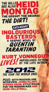
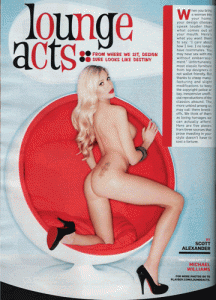
It starts with the cover…unusually old-style typefaces seem out of whack yet ultra-hip next to the photo of a very dirty Heidi Montag. The promise of a previously unpublished work by Kurt Vonnegut adds to the vintage flair. Inside, the 50’s/60’s cool continues with a pictorial on Mid-Century Modern furniture, complete with pricing for the originals (ie, through the roof) and well-made knock-offs (ie, cheaper than half the price), plus some beautiful dolls to accent the furniture’s curves.
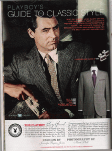
Then there’s the men’s fashion section. This section, usually occupied by trendy-looking male models in $5000 wardrobes, kicks off with a vintage photo of Cary Grant, dressed to kill. The section is full of vintage pix of celebrities, including Jack Kennedy in a pair of Ray-Bans, and features tips on buying like-style threads in the modern world. (Here’s the online version).
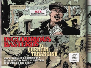
 There are subtle retro hints throughout the magazine, from the more-classic-than-usual party jokes to the cartoons. But just when you least expect it, you get slammed in the face with Quentin Tarantino’s graphic novel version of Inglorious Basterds. Set in WW2, the panels look like they were hand drawn in 1943 and sealed in a time capsule. The colors, style, typefaces all scream 1940’s…or at least the way they would have done it in the 40’s with better printing technology and no censors.
I’m sure the art director would have loved to have the entire issue go retro, keeping the theme throughout. Last month they magazine even featured a new twist on the old Playboy Bachelor Pad, and there’ve been numerous spreads showcasing the magazine’s covers and models of the last 50+ years over the last few months. Unfortunately advertisers can’t always accommodate a theme, and pictorials of the models are shot way in advance. They might consider coordinating an all-retro issue in the future, as a special limited edition issue. I’m sure it would be at home on Tiki Bars bachelor pad coffee tables all over the world.

Great blog first off! Fantastic design and very well written. Informative and and entertaining.
I really like that playboy cover and some of the pics. From onside make it look like a winner.
Reminds me ofthese vintage Gentlemen’s mags I have from the late 50s and early 60. Like Gent and Bachelor. I bought these off of Ebay about 4 years ago. They had some nudity but not much and usually very tasteful. I like the mags for the style they are in and to get a picture of life in that era. Fantastic!